Thursday 15 November 2012

3D Marco

Here's a 3D model of Marco I'm currently working on. I'm proud of it so far, but I just need to iron out some of the bumps in the mesh which I shall do soon.


I'm also int the process of rigging it, which is taking a bit of time. Hopefully I'll have it ready to animate for the project deadline.


Thursday 8 November 2012

Life Drawing No.1

Some Life Drawing work I created over the last month.  The first one was created on brown paper with oil pastels. My aim was to utilise perspective to create a foreshortening between the model and his environment.

9/10/12
42 mins

This next one was initially drawn on brown paper, unfortunately, the dots were not showing within the final image when photographed. As a consequence, I decided to redraw the image in Photoshop. The focus of this image was to represent details of the model rather than the environment. I added a some creases below the model just to express the substance he was sitting on.


2/11/12- 3/11/12
Original Drawing - 25 mins

Sunday 4 November 2012

My Plasticine Gromit

Here's a little Plasticine model I made of Gromit at one of FLIP animation festival's workshops with Jim Parkyn from Aardman. Considering there's no wire framing in the model, I'm pretty impressed with how it turned out. If I had time I'd smooth out the surface a bit more, but due to other projects at uni I think I'll leave it as it is.


Here's a link to FLIP's website:


Friday 2 November 2012

Polar Opposite Characters No. 5

Here's my final polar opposite characters, for this project anyway. The aim for these two characters was to sample two different positions of authority. Lionheart is supposed to represent an order of control and order, passed down to him by his commanding officer.


Here we have Typhoon, a character meant to represent pure power. I created him mainly as a plot twist to represent Storm's alter-ego when he gets angry or stressed, which he rarely ever does. He is also different to Lionheart in that he is not bound by limits or restrictions. I particularly liked the cape as it represents authority.

Here's the final design. I'm not quite sure what to make o him to be honest, as he was created due to time limitations. I also think it may limit Storm's emotions and could be out of character for him. I might replace Typhoon with a different character, but for now he's being shelved for possible future use. 


Monday 15 October 2012

Wolf and Gang Logo Design

Now for something that relates to my Graphic Design background. Having contacted the animation studio Carse and Waterman, they asked me to create a logo for electronic group Wolf and Gang. I have to admit this felt a bit alien to me at first since I haven't done anything with typography in years. I decided to approach it like I would with character design, and experimented with typefaces and wolf designs.


Here's my proposed final logo that I finished yesterday. I've sent it to Carse and Waterman, and now I'm waiting for feedback from the band to see if they'll use it. I'm excited by the prospect of it being on an album cover, let's just hope they like it...


Btw, here's a link to Carse and Waterman's website, enjoy:

http://www.carseandwaterman.com/

Tuesday 9 October 2012

Polar Opposite Characters No. 4

Next up, the birds. This time I want to focus on the differences within a family. I decided to focus on a son and mother relationship, as I currently don't have any characters that focus on the differences between a boy and a girl.

Here we have Birdbrain, the mad scientist of the crew. After investigating with his design numerous times, I realised his first design was fine as it was. Apart from a thin neck, his design didn't change at all when completed.


Here's Birdbrain's overbearing mother, Featherbrain. Unlike the other girls who looked somewhat tough, Featherbrain had to look sweet and innocent. Her design also had to look like a housewife and fairly traditional, unlike the other characters who looked futuristic. I think I succeeded, and overall I'm happy with her design.


Saturday 6 October 2012

Zombie Sculpture

Another sculpture, this time with a definite creepy twist. Zombies are a common to create in sculpture, so I wanted to make her silhouette unique.  To do this, I made the eyes very grotesque and making the intestines sprawl out at the back like a tail. This may not be to everyones taste, but I'm proud of it.


Thursday 4 October 2012

Polar Opposite Characters No. 3

Time for the girls to shine this time. This time I'm starting with the enemy, Princess. My aim with this character was to put an emphasis on her ugliness, despite her name suggesting otherwise. I gave her some slight cleavage in areas to suggest her vanity. I was originally a bit unsure about the breasts, but I decided that they added to the humour of the character.


Not much changed during her final design. She was given a bit more flab in areas and slightly bigger high heels, that's really about it.


Next we have Storm's love interest, Roxie. Unlike Storm which looked more funny and dumb, Roxie had to look more mature and cooler. After much investigation, I decided that the circled design looked best as I liked the spiky hair. However, I felt that her current design wasn't feminine enough, so I knew I wanted to change her final design.


I experimented with her design, and fell in love with it (not in a weird bestial way). Unlike Storm and Marco who's eye shapes were more cartoony, I made Roxie's look more cat-like to suggest her maturity. I made her hands and feet more smaller to make her look less manly.


Tuesday 2 October 2012

Snoop Dogg Caricature Sculpture

Hey all, time for something completely different to what I usually show. Here's a sculpture I created caricaturing the famous rapper, Snoop Dogg. I chose him as I feel he has a unique facial structure and is easily recognisable. I gave him an oversized head to exemplify this. I also gave him his trademark hand sign as well. Hopefully I can make more sculptures in the future.


Wednesday 26 September 2012

Polar Opposites no.2 Turnaround Sheets

More of my polar opposite characters. I used the same techniques as mentioned in the previous post.  Marco and Hooves were created to be sidekicks to Storm and Blade respectively. However, they also had to have differing personalities from their friends, which in turn made them different from each other.

Marco's appearance changed dramatically, and is probably the character I had most trouble with designing. I think I did well with his design, and he's got the initiated 'awww' response going too. The nappies are funny as well. :D


I really like Hooves' design, and he challenges Storm for my favourite character. I changed Hooves' fur to a traditional brown colour. I also resized his head to a bigger size to make his long neck look funnier. I think he'd be really fun to animate, hopefully my lecturers will like him enough to let me do so.


Take care all :) x

Tuesday 25 September 2012

Polar Opposites no.1 Turnaround Sheets

Well, here's my first two polar opposites in preparation for uni. I took the original images and traced over the lines using the pen tool. Once done, I exported the images to Photoshop to colour underneath the lines. I've measured out the characters proportions using invisible lines, and they're pretty much spot on. I might try and do more turnarounds if I have the time, but for now these will do just fine.

I'm really happy with the way Storm has turned out, and is perhaps my favourite character of them all. I added a gun to his belt just to give him a bit more of a cool factor (even though he wouldn't know how to use it lol). I'm still not sure whether to make him speak or not. I added the S logo to his belt and gun as heroes like to shamelessly promote themselves.


Here we have Blade, the badass fox. I like all the visual suggestions I've added to his uniform and body. My intention was to leave people guessing about his persona and background, which I think comes off pretty well. My only concern is if he's perhaps too detailed to be animated, but I'll solve that dilemma soon.


I should have more character turnarounds up soon, stay tuned! :)

Tuesday 18 September 2012

MORE experiments...

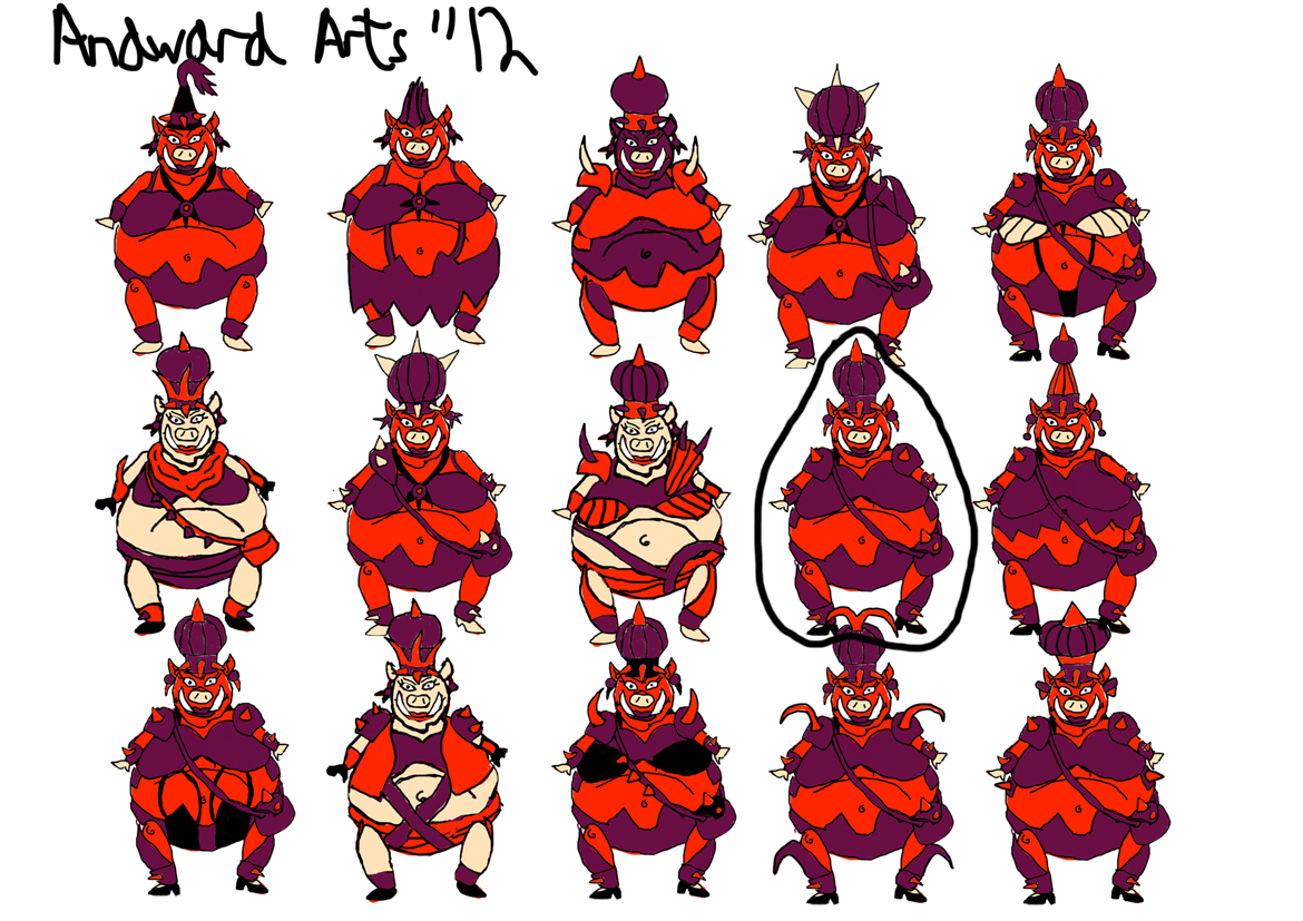
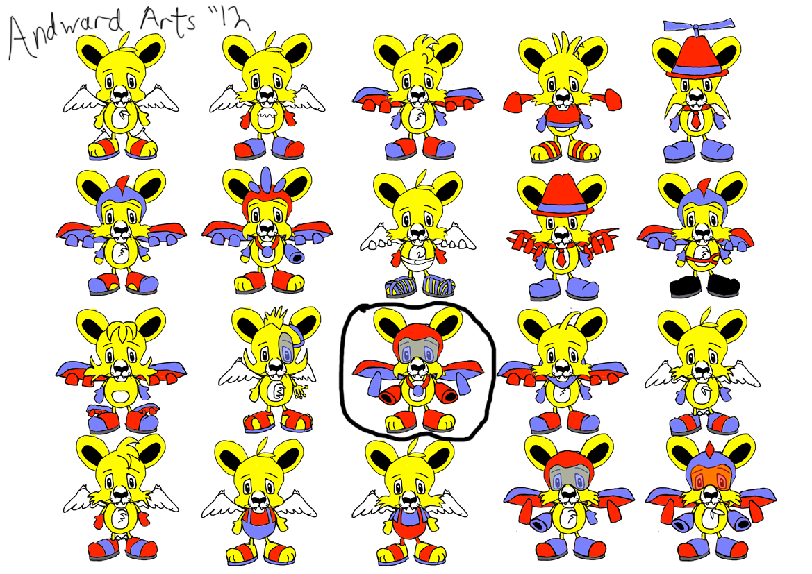
Time to show off more of my 10 characters me thinks. As with Storm and Blade (the fox), I drew out the characters first and then scanned them into Photoshop to experiment. Circled designs are ones that I chose to put into further development.

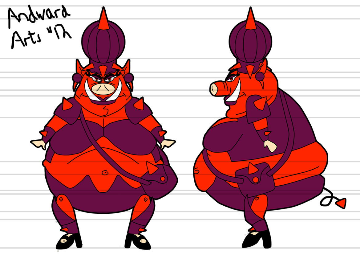
Here we have Hooves, a muscular anthropomorphic horse. His design had to show power and evil qualities. I particularly liked this one as it vaguely reminded me of a rugby player. His hair colour will be different in the final design, at the moment he looks like a zebra without its stripes.


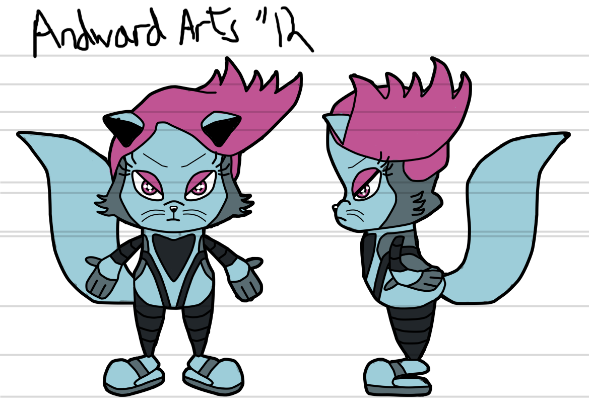
Next is his polar opposite, Marco, a flying lion cub. He had to be cute, even more so than Storm. However, he also had to look cool. I chose this design as it made him look up to date with technology while still making him look cuddly. His design will change in the future, as at the moment his ears look a bit too mousey.


Last of all, Lieutenant Lionheart, a brave and valiant soldier. In the first few designs, my original thought was to make him an American. I then decided that because the show is set in the UK, it might be better to give him a British origin. I made an amalgamation of a soldier and police officers uniform, with patches of silver to reflect his rank. I chose this design as it looked like he's ready for battle.


Sunday 16 September 2012

The Early Days...

Hey, been a while since I uploaded. Well, no time like the present. Here's an animation I did at the very beginning of my uni course. It was my first time doing hand drawn animation and I think I did it fairly well. It's pretty short, but I hope you enjoy.

Tuesday 26 June 2012

Polar Opposites Character No. 2

This is a post for my character who contrasts my first one. Unlike Storm who's emphasis was goofy and cute, this character needed to portray a vicious and intelligent side. Originally I was going to make this character a dog, but then I realised this has been done to death, so I decided to make him a fox which are naturally quite sly.


The original drawing of the fox. As I had never drawn the character before, it took me a few tries to make his silhouette iconic. I used a lot of triangles to construct the character to keep with his stealthy look. I left the tail out as the page was too small to make it the appropriate size.


Next, experimentation:


When creating his costume, I wanted it to give visual clues to his background while enhancing his silhouette. The tail was designed to look bigger than him for comedic effect. I personally like the one on the top right, it was inspired by dub-step group Nero (which were AWESOME at Hackney Weekend btw :D). I've thought about calling him Nero in tribute to them, which I hope they'd appreciate.

Just in case you don't know who Nero are, here's a photo of them: